

Showing posts with label director's notes. Show all posts
Showing posts with label director's notes. Show all posts
Monday, July 29, 2013
Wednesday, July 3, 2013
BOB SHELLINE - CRITIQUE
All in all, solid rough designs. Now it's time to start pushing them further and making them look more like they belong in a fighting game.


Tuesday, June 25, 2013
Jim Bob's Killer Kharacter - Color Variations + Redesign
Alright Jim Bob. So...these are the colors I'm liking. For 'E' I tweaked the color levels so the green's more yellow. I figure maybe his power could be electricity. Garjin uses greenish spirit fire as his power so I wanted to steer away from that.

Once I got to thinking about different kinds of energy, I thought "Ermergersh! What if the blue guy was a water bender-like guy!?" I also just finished watching Thor on Netflix and the Frost Giants have these ice sword arm thingies that they can conjure up...which is killer cool. So I added that.

THOUGHTS? FEEDBACK?
ANYONE IS WELCOME
Wednesday, May 8, 2013
JEFF AND TOMMY...NEW LOOK

Here's a paint-over I did of the current Tommy model. He'll most likely have blonde hair now to match Abby.

Here's the new Jeff, which is also a paint-over. With Meredith gone, we lost our hair expert. So, the new Jeff will be wearing a baseball cap. It adds a little bit to his character and solves the hair problem for us.
Wednesday, April 17, 2013
THE LAST LEG OF THE PRE-PRODUCTION JOURNEY OF PWNED
EVERYONE!
I know it's been quiet on the design end of the blog for a while. I'm in three design classes this semester and they all sort of converged and I had to focus on getting stuff done, but I'm sort of free now! (Sort of being the key words)
First off, let me just say I'm darn pleased with how much you guys put into this. We did a lot of work in a short amount of time and it feels like it just blew right by, but we're still not quite done yet. The posters are important to Jeff's room and they need to get finished. It's hard to figure out how things will look when rendered if we have blank posters on the walls. WE NEED THEM TO GET FINISHED. I WANT THEM FINISHED!
A note to Austin:
Austin, I did a draw-over of your evil Estefan a while back and have seen nothing since. It still needs work. Are you still going to work on it? If the answer's no, I'll get someone else to build off the design we have so far.
POSTERS!!
The posters are not done. The only poster I'm sold on thus far is Kiersten's Zombie poster. Kiersten, I've done draw-overs of your previous posters and I've seen nothing back. Are you still going to work on them? Also, don't jump right to final. Do some rough sketches first so that I can see the direction you're going. Nathan, the Blue Shift poster is too bright and it's drawing too much attention in the scene. It looked cool, but when it was put in the scene and rendered out, it doesn't fit. It needs to be re-worked. Also, the Samurais vs Zombies poster needs work. I think I wrote notes and stuff from way back.
IF you put time and effort into these posters, they could be solid illustrations for your portfolios.
If you guys are burnt, tell me. If finals are crazy and you can't spare the time, tell me. If you're going to work on these posters tell me. If you ARE going to work on these posters, it needs to be quality work like everything else we've done thus far. JUST TELL ME ASAP!
Thanks, and yes I still love you.
Wesley
Monday, April 8, 2013
H5 Redo

I'm not really sure why the light for H5 was right over his head, so I switched to where the primary light source was the tv. Also, if we're still planning on having the red lights from the tv shine on his skin...then I figured I'd pain them in a bit. This was quick (10 min.) and crappily done mind you, but this is more the direction I'd like to go for this shot.
Tuesday, April 2, 2013
Kiersten Paintover

Hey Kiersten. Here's a paintover of your poster for the Woodward Gaming Expo
Here's what I did:
- The background looked really flat. I added splashes of color just to make it more interesting
- The Gamernonicon text was getting lost, so I upped the contrast. I also tried to make the lettering on the bottom right pop a little more.
- Since the characters are likely from 3D videogames, I added an overlay and a multiply layer for highlights and shadows, just to give them a little more form.
- The little tiger guy's hand was creating a tangent with the soldier's arm, so I moved it forward a bit. I'm wondering if his staff is creating a tangent with the cowgirl too...
- The soldier's pose was still odd. It looked like a sexy lady pose. I got rid of the twist in his legs and gave him a more standard pose.
- The cowboy girl is fantastic, but seeing as how she's from a videogame, she needs to be pushed more. A plain ol' cowgirl is nice, but she needed something more. So I added the cyborg arm and sunglasses. You can change whatever you want, but that's just what I did.
- I added tatoos to the fighter for the same reason I added the cyborg arm and sunglasses to the cowgirl...just to jazz him up a bit. Videogame characters are OVER THE TOP
Anyways, hope all this helps.
Keep up the good work! And thanks for doing this!
Monday, March 25, 2013
For Austin

Hey Austin. I don't know if this is helpful. Since he's evil, I tried to make his pose more sneaky and menacing with hunched shoulders. If you like your original pose, that's fine. I turned his leg out so he looks a little more stable on his feet. I'm liking the overall design so far. Keep going!
Wednesday, March 13, 2013
NOTES!
Sorry it's taken me so long to get back to the film. But here I am. Thanks for being patient.


Wednesday, March 6, 2013

Friday, March 1, 2013
BOARDS ARE DONE!
Almost 700 boards later, the film is officially blocked out. Fight scenes and all. Next comes clean-up and putting them into an animatic. Stay tuned!
Time for me to sleep...zzzz...
Thursday, February 28, 2013
FINAL CDs
Hey everyone! Thanks for all your hard work on the visual development of the film. If you've taken this class for credit, you need to take everything you've done this far, put it on a CD, and take it to Kelly's office Monday, March 4th.
Thanks!
Monday, February 25, 2013
IT'S THE FINAL WEEK GUYS!
Hey everyone. So it's the final week of the development class and there's still a lot that needs to be done. I know I don't explain myself very well sometimes, so I'm posting this to hopefully ease any confusion. Here are some of the key things to remember:
- ENVIRONMENTS
- The creative vomit stage is over. I want frozen environments for the first level. Ice-caked temples, snow-covered cliffs etc.
- Iterations rather than exploratory sketches. There were not as many environment thumbnails as I had hoped. Regardless, if you feel like you have a strong composition in one of your thumbnails, build off it. Avoid experimenting with further compositions; it's time to refine and hone in. I like Alyssa's composition. Do draw-overs of her piece and now focus on exploring the architectural elements and details.
- Factory needs more stuff. Looks at assembly line reference and put a sci-fi twist on it.
- VIDEOGAME CHARACTERS
- There are 10 other characters for the game that need to be designed as well as the look of the menu itself.
- black guy
- caliber DONE
- chelsea's fox character design
- garjin DONE
- vampire lady (not slutty)
- evil estefan
- female warrior (barbarian...again, not slutty)
- lemming
- generic karate man (like ryu but cooler and more unique)
- kendall's space rocker girl
- dreamgiver
- evil kelly
- *joy's character design
- *might be a figurine rather than a videogame character
- OTHER STUFF
- Posters! Refer to the post from a while back that describes what I'm looking for with the posters. TELL ME WHICH ONE YOU'RE DOING BEFORE YOU DO IT.
- Food items:
- Cereal boxes
- Cup o' noodles
- Mesa Dew energy drink
- any other miscellaneous food items Jeff would have lying around

For Mike


It looks really good so far Mike. Basically, all I did was vary the height of the buildings a tad to add more interest and stuck in Caliber and Garjin for scale.
Rather than doing different iterations, I want you to focus on this one. Flesh out the details, design any additional elements and add a splash of color.
Saturday, February 23, 2013
Paint-over for Joy
Tried to add more areas of interest as well as more of a middle ground. Hope it helps

Friday, February 15, 2013
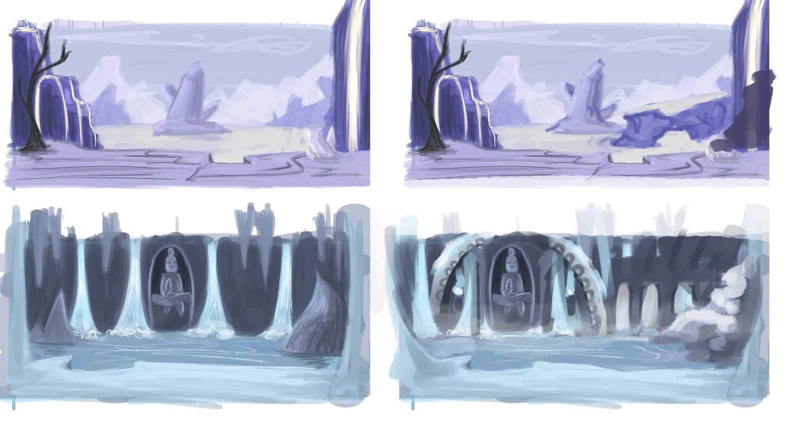
DIRECTOR'S NOTES ON ENVIRONMENTS
HEY EVERYONE
Alyssa and I have been doing some thinking about these videogame environments and here are some things we'd like you know/consider:
1 - For the first environment (a.k.a "The Temple") we'd like to open it up to WHATEVER YOU WANT. Procedural modeling can be many different things such as rocks, trees and pillars. It doesn't have to JUST be pillars.
2 - For the first environment, stay away from the cathedrals OR if you're designing a cathedral level, make it unique. The environments are going to be dynamic and interesting, so we're thinking of them almost like paintings. Compositionally, looking down a cathedral is kind of boring because it's just simple one-point perspective. Aesthetically, cathedrals are gorgeous but we've seen them before. They're very recognizable. From here on out, make them more unique. What would an elvish future cathedral look like? What would a cathedral look like after nuclear winter? Think of the artistic elements and the composition of the background, make it interesting, and make it unique.
3 - I've spoken a bit about the "difficult" thing we're trying to introduce into the film. In Lemmings it was the million lemmings falling over. Pajama Gladiator had the huge crowd (etc.) The "difficult thing" in this game will probably be the factory level, not the temple level. The fight between Jeff and Tommy will be VERY quick, as Jeff basically obliterates him seven seconds. That said, the majority of the time for the videogame will take place in the second level, the Factory, where Jeff and Abby face off. This will have boiling lava pots, floating robots, mech arms, smoke, particle effects you name it. The temple level needs to look beautiful, but just know that there won't be as much dynamic stuff happening in it.
4 - Regarding the factory level, it seems like you're all afraid to tackle designing heavy machines. Don't be. Find lots of reference ranging from realistic engines and car parts to Star Wars tech and then just go for it. Thumbnails are meant for brainstorming, not for perfection. Jake Parker introduced me to the term "greeble." Basically, it was invented by ILM to describe exposed technology that serves no purpose other than to look cool. These are some examples from Mr. Jake Parker.

The nice thing about this factory is that it will be most likely futuristic. That means we can greeble the heck out of it. The technology doesn't have to actually exist, it just needs to looks cool.
THAT IS ALL.
Know that I still love you...except AJ.
Wesley.
(P.S. Just kidding AJ. Thou knowest I love thee)
CALIBER - design only
CALIBER'S FINAL DESIGN
Hey everyone. Below is the final design for Caliber, Jeff's fighting character. I had a pretty clear idea of what I wanted for Jeff's final design, but Caliber was more vague. Originally, I saw him as a super-advanced space soldier, then Kendall's design made me think more on the possibility of Caliber being a bully mercenary. I took some of my favorite design elements from what you guys posted and designed Caliber to (hopefully) compliment Jeff. His color scheme is very similar in addition to the goatee and his hair color.
Thanks to everyone on the Caliber team!

IMPORTANT:
Kiersten will be doing the turn-around of Caliber, but we'd still like to have a nice painting. I'm looking for volunteers. This needs to match the standard of the paintings we've done already.
Also, Caliber's guns and elements for his obliteration (finishing) move need to be designed. If you're interested in doing some designs, you need to let me know ASAP!
Monday, February 11, 2013
SOMETHING TO THINK ABOUT...
So, the story team and I showed Kelly the updated boards and he voiced a legitimate concern about Caliber. With what happened in Connecticut and the movie theatre in Colorado, gun violence is a hot issue in America. Seeing as how this is BYU, it's better to err on the side of caution and be conservative with our fight choreography and design.
That being said, I had a good feeling about Caliber. I thought using various guns in various different ways would be cool, and it might be possible to still do so...but we have to figure out a way to do it that doesn't make people think to actual gun violence. As you design him, make him more of a super-cool soldier than a brute or bully. Instead of realistic weapons, give him lazer guns or plasma weapons.
Like I said, I had a good feeling about Caliber, but I don't want to make a big deal about it and I'm not (yet) married to the idea of a gun soldier fighter. If something better comes to your mind for Jeff's fighting character...sell it to me through your designs.
That is all. Know that I still love you.
WESLEY
Tuesday, January 22, 2013
DIRECTOR'S NOTES
Hey everyone. Sorry things have been quiet on the blog for a few days. I've been working on another project and it's taking up too much time. Anyways, here are some notes for what you guys have submitted since last week.


I feel like I need to say something. The designs for Jeff and Abby were finalized last week. This means NO MORE CHANGES. It's no longer the time to make major changes to his clothing or his hair or his glasses. If you have suggestions for how to streamline the designs, that's fine...but don't make major changes please.
Everything on Jeff and Abby from here on out is to A) Promote the film B) Explore clothing colors and designs, NOT clothing options (Jeff is wearing shorts, sandals and socks, and a fitted t-shirt and Abby's wearing footies) or C) Aid the modelers/animators.
Subscribe to:
Posts (Atom)